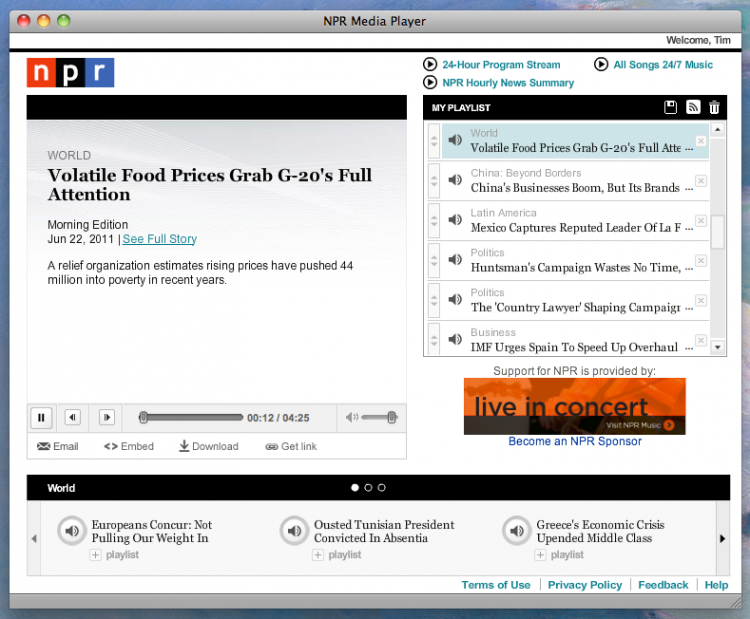
Here’s the original:
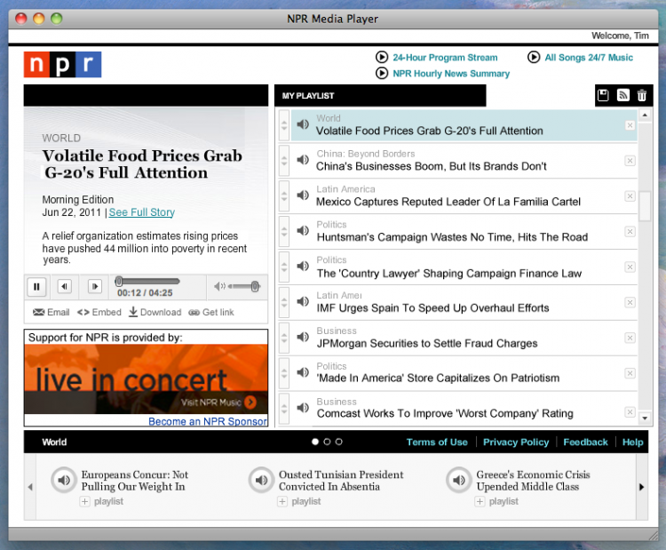
Here’s my suggestion:
The plusses are that there is much more space for titles in the streaming list. I can read the whole story without guessing what the story might be. I hate not knowing what the story is when I am building my playlist. This solves it.
I took space away from the “now playing” box. It’s useless, wasted space.
With this layout, there is more space for the sponsorship image.
Something to consider – the box at the bottom can probably be dispensed with, unless NPR has user data that says that area is used by users.

