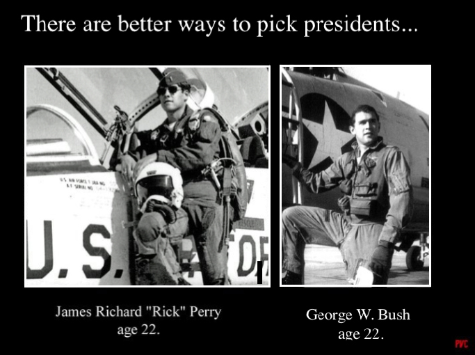
On the original, the two photos look terrible when adjacent to each other. This is exacerbated by the fact that the two images are not the same width.
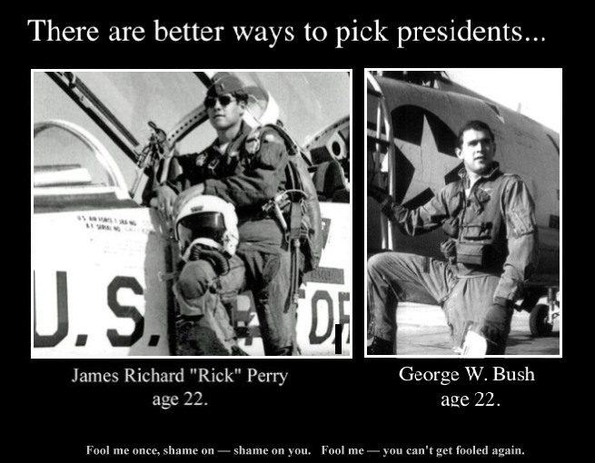
I’ve fixed this by moving the images apart. That was sufficient. A small 3px white stroke around the inside of each made the fix even better.

I moved some stuff around and added a small quote, which I think makes it perfect:

