I signed up for an account today with San Francisco Fire Credit Union. I wrote about this decision here. (Since this is a UI post, I want to keep the political stuff separate.)
I like writing about UI issues. It’s often the only way to adequately describe a problem. It also saves the call center from having to listen to my complaining.
So, let’s dive in.
The new-account signup process is pretty straightforward:
- User is informed there will be a five dollar fee to open up account.
- User selects what type of accounts he wants (I picked four of them: checking, savings, money market, and a really neat one called “holiday savings” that’s basically a Christmas fund)
- User picks password
- User offered overdraft protection
- User shown TOS, EULA, Fees, Disclosures and Agreements (which, by the way, were in plain English)
- User fills out personal information on successive screens
- Review page
- Several pages where they check user’s identity against others with the same name (this was a series of yes/no questions)
- Account approved screen
- User presented with offer for Home Equity line of credit (I said no)
- User selects how to fund new account (Credit Card and some other choice, I forget)
- User inputs payment information
- User presented with Deposit Information and final approval button
This seems like a lot of steps but it’s really not, considering you’re opening a bank account and they need all this info. And it was mostly pretty quick.
I ran into the first problem with picking a password.

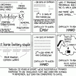
SFFCU uses a 1990’s password philosophy: between 6 and 10 characters. This is insecure. My Wells Fargo password is 32 characters long.
I don’t want to make light of this issue by referring to a cartoon, but XKCD explains this better than I ever could:

Encountering low character limits on passwords is aggravating, especially when it’s for a site that stores my financial information. It causes fear, uncertainty and doubt in the minds of users who are savvy when it comes to security – a population that is growing. I give thumbs-up for allowing special characters but I’d really like to see the limit increased north of 22 characters. There’s no reason not to (it’s not like longer passwords take up a whole lot of space).
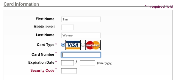
The next issue I ran into was inputing payment information to fund the account.

There’s a javascript running on this page which prevents me from copy/pasting my credit card information into the fields on this page. Obviously, this is not a big deal, but it is a little annoying. It means I have to leave the computer, find my wallet, get the credit card out, and input the numbers manually and hope I don’t make a mistake. I tried to turn off the javascript but that just broke the page altogether. Arggghh!
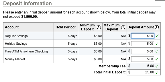
The next issue I ran into was at the end screen, User presented with Deposit Information and final approval button:

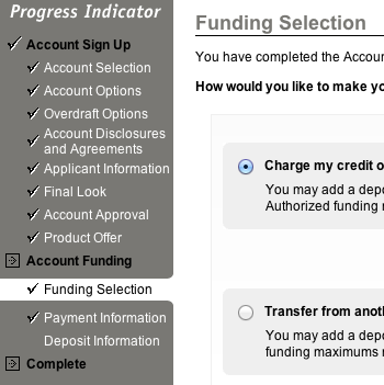
I didn’t realize it cost five bucks each to open all of these accounts. I got the impression from the first screen that it would cost only five bucks total. No big deal, I’ll simply back up and un-select all but one account. But here’s where I ran into an issue that made me have to start over from the beginning: I could only back up three screens, to the funding selection screen:

There is no way to back up before the Funding Selection screen. The user has to abandon the process and start over. Again, not a big deal, and probably an oversight somewhere. Still, I can’t imagine this doesn’t cause at least a small amount of form-abandonment.
There are also a few CSS issues here and there that tell me the UI designer did not conduct sufficient cross-browser testing, issues like these:


Overall, except for the password limitation, I don’t think any of this is terrible. Although these sorts of issues would be unforgivable in a national bank like Wells Fargo (the bank I’m leaving), SFFCU is a local Credit Union and they probably do not have the resources to conduct any user testing of their UI. But I think they should find a way. User testing is important. Sometimes it can suss out issues.
Regardless, I’m now an SFFCU account holder. I’m hoping I’ll be a happy one. I never had any issues with Wells – their Haight branch is super friendly and I like the convenience of them being so close by. But it’s time to put my money where my mouth is and support a local business.
UPDATE
I was sent a PDF of a signature card to fax in. I printed it out on my scanner/printer, filled it out, scanned it back into the scanner/printer, and emailed the PDF.
A short time later, I got an email back saying,
HI Tim,
Please fax it to us or send it. For security reasons, I cannot except a scanned emailed version of your signature card for any emailed membership information can be intercepted. Please fax to 41-674-4691 or send to: 3201 California Street San Francisco, CA 94118.
Thank you,
This is hilarious!
It’s 2011. I haven’t seen a fax machine in almost a decade and it’s been well over a decade since I’ve used one. Does anyone still send Faxes? We have email now!  Email is better. The resolution is limitless. It’s in color. It doesn’t use paper unless you tell it to. Fax machines were a plague and we are good to be rid of them.
The part about intercepting an attachment is interesting. I suppose it is possible if the email is going from a POP-account to another POP-account and you had one of the servers in between, AND if you knew when the email was going to be sent, AND if you could man-in-the-middle the files, alter them, and send them on quickly (a lot of if’s). But  a gmail attachment?  gmail has never had an interception. When gmail is proven to be insecure, it will be on the front page of the New York Times.
I suppose I can go through the trouble of signing up for an efax account and go through exactly the same process: emailing efax my document and having efax send the fax machine a fax of my document. But efax charges to send faxes.
I considered asking her to print out the email, walk it over to the fax machine and drop it in the received tray, but I doubt she would get my pithy humor. Also, I don’t like to mock underlings for dumb decisions by management. Often these security rules are industry best-practices and are just part of the institution.
I think the best way to handle this will be to rely on snail mail. It’s half a buck and a trip down to the mail box and I guess I could use the exercise. I’ll grab a latte on the way back.
UPDATE #2
I just got a call from a very nice lady who told me that they can, in fact, accept my signature card by email. She called me, on a Sunday night no less, to tell me not to go through the trouble of snail-mailing my card in.
WOW!
I have been a member of this bank for less than 6 hours and I’m already loving them!
I will be turning up the heat on my friends to jump ship from their to0-big-to-fail banks.